Introduction
Modern web design in 2025 is about more than aesthetics—it's about creating fast, accessible, and engaging experiences that work seamlessly across all devices and user abilities.
Core Design Principles
1. Mobile-First Design
With 60%+ of web traffic from mobile devices, mobile-first is no longer optional:
- Design for smallest screens first
- Progressively enhance for larger displays
- Touch-friendly interactive elements (minimum 44x44px)
- Thumb-friendly navigation zones
2. Performance is Design
Slow websites lose users:
- Core Web Vitals matter for SEO
- Aim for sub-2-second load times
- Optimize images aggressively
- Use lazy loading strategically
3. Accessibility is Not Optional
WCAG 2.2 AA compliance is both ethical and smart business:
- Proper semantic HTML
- Sufficient color contrast (4.5:1 minimum)
- Keyboard navigation support
- Screen reader compatibility
- ARIA labels where needed
Modern Design Patterns
Minimalist, Content-First
Clean designs that let content shine:
- Ample whitespace
- Limited color palettes
- Clear typography hierarchy
- Purpose-driven interactions
Micro-Interactions
Small animations that provide feedback:
- Button hover states
- Form validation feedback
- Loading indicators
- Scroll-triggered animations
Dark Mode Support
Users expect dark mode options:
@media (prefers-color-scheme: dark) {
  :root {
    --bg: #1a1a1a;
    --text: #ffffff;
    --accent: #007AFF;
  }
}
Typography Best Practices
Hierarchy Matters:
- H1: 2.5-3rem (40-48px)
- H2: 2rem (32px)
- H3: 1.5rem (24px)
- Body: 1rem (16px)
- Small: 0.875rem (14px)
Readability:
- Line length: 50-75 characters
- Line height: 1.5-1.8
- Paragraph spacing: 1.5-2em
Color Psychology
Colors influence user behavior:
- Blue: Trust, professionalism (finance, healthcare)
- Green: Growth, sustainability (eco, health)
- Red: Urgency, excitement (sales, food)
- Purple: Luxury, creativity (beauty, tech)
Use 60-30-10 Rule:
- 60% dominant color
- 30% secondary color
- 10% accent color
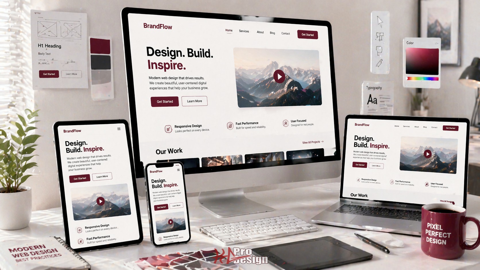
Responsive Design Strategy
Breakpoint Strategy
/* Mobile first */
.container { width: 100%; }

/* Tablet */
@media (min-width: 768px) {
  .container { width: 750px; }
}

/* Desktop */
@media (min-width: 1024px) {
  .container { width: 1000px; }
}

/* Large desktop */
@media (min-width: 1280px) {
  .container { width: 1200px; }
}
Performance Optimization
Image Optimization
- Use modern formats (WebP, AVIF)
- Implement responsive images
- Lazy load below-the-fold images
- Compress without quality loss
Code Splitting
- Split JavaScript by route
- Defer non-critical CSS
- Inline critical CSS
- Use CDNs for static assets
Testing Checklist
Before launch, verify:
- Lighthouse score 90+
- Mobile responsiveness
- Cross-browser compatibility
- Accessibility audit passed
- Forms work correctly
- All links functional
- SEO meta tags present
- Analytics integrated
Tools of the Trade
Design:
- Figma (design and prototyping)
- Adobe XD (UX workflows)
- Sketch (Mac-based design)
Development:
- Tailwind CSS (utility-first CSS)
- Framer Motion (animations)
- React/Vue/Svelte (frameworks)
Testing:
- Lighthouse (performance)
- WAVE (accessibility)
- BrowserStack (cross-browser)
Conclusion
Modern web design requires balancing aesthetics, performance, and accessibility. The best websites:
- Load fast and work smoothly
- Are accessible to all users
- Look great on any device
- Guide users toward goals
- Reflect brand identity
Focus on user needs, measure what matters, and iterate based on data.
Need Design Expertise?
KG ProDesign creates modern, high-performance websites that convert visitors into customers. Our web design services combine beautiful design with technical excellence -- see examples in our portfolio.