Introduction
Your website is your most important employee. It works twenty-four hours a day, seven days a week, and it is often the first interaction a potential customer has with your business. The question is whether it is welcoming people in or turning them away at the door.
Industry research consistently shows that visitors form an opinion about a website within fifty milliseconds. If your site is slow, confusing, or outdated, those visitors are not coming back. They are going to your competitor's site instead.
The frustrating part is that the most damaging website problems are often the easiest to fix. In this article, we will walk through five common mistakes that cost small businesses real customers and real revenue, along with practical steps to address each one.
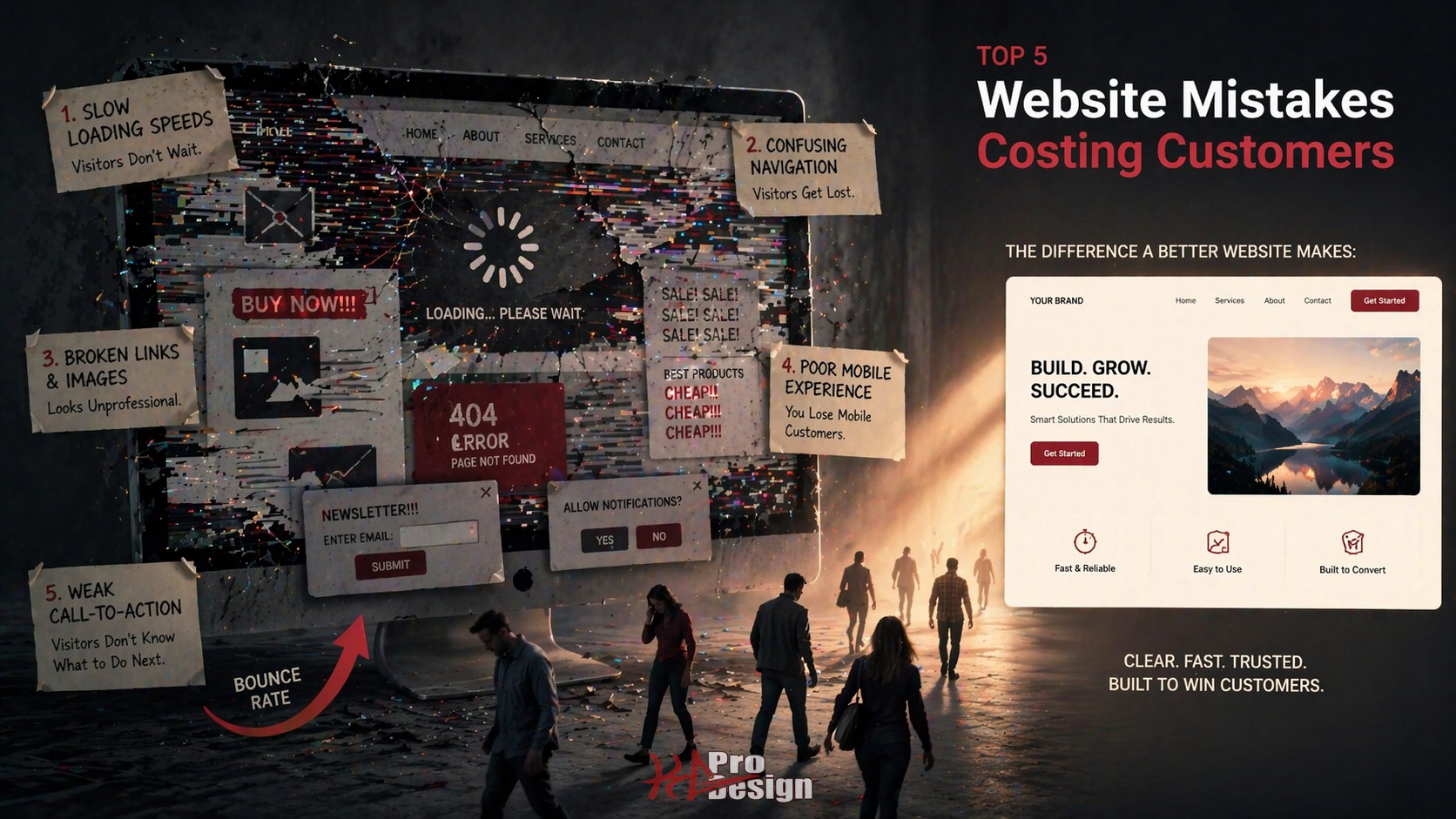
The 5 Costly Mistakes
1. Slow Load Times
Nothing kills a first impression faster than a loading spinner. Studies indicate that more than half of mobile visitors will leave a page that takes longer than three seconds to load. For every additional second of load time, conversion rates drop significantly.
What this looks like in practice: A potential customer searches for your service, clicks on your site, stares at a blank screen for four seconds, and hits the back button. They click the next search result. That competitor's site loads instantly. You just lost a customer, and you will never know it happened.
Common culprits include:
- Uncompressed images: A single hero image shot from a DSLR camera can be five megabytes or more. That alone can take seconds to load on a mobile connection.
- No content delivery network (CDN): Serving files from a single server location means visitors far from that server experience slower loads.
- Render-blocking resources: JavaScript and CSS files that prevent the page from displaying until they finish loading.
- No caching strategy: Every visit downloads the same resources from scratch.
How to fix it: Start with Google PageSpeed Insights. It is free, and it will tell you exactly what is slowing your site down. Compress images, enable browser caching, and consider modern frameworks that optimize performance by default. Core Web Vitals are now a ranking factor in search results, which means slow sites get penalized twice: once by impatient visitors and again by search engines.
2. No Clear Call-to-Action
A visitor lands on your homepage. The design is clean. The content is decent. But what are they supposed to do next? If the answer is not immediately obvious, you have a call-to-action problem.
What this looks like in practice: A service business has a beautiful homepage with paragraphs about their history, their values, and their team. Nowhere on the page is there a clear button that says "Get a Quote" or "Schedule a Consultation." The visitor reads, nods, and leaves. They had interest but no direction.
Every page on your site should answer one question for the visitor: "What do I do next?"
- Homepage: Primary CTA should drive toward your most valuable conversion, whether that is a consultation request, a quote form, or a product demo.
- Service pages: CTA should connect the specific service to a next step. "Ready to modernize your website? Let's talk."
- Blog posts: CTA can be softer but should still exist. Guide readers to related content, a resource download, or your contact page.
- About page: This page gets more traffic than most businesses expect. Include a CTA here too.
The fix is straightforward. Audit every page. If a visitor cannot identify the primary action within five seconds, add or improve the CTA. Make it visually distinct. Use action-oriented language. And make sure it leads somewhere useful, not a generic contact page with twelve form fields.
3. Not Mobile-Optimized
More than sixty percent of web traffic comes from mobile devices. For local businesses, that number is often higher because people search for services on their phones while they are out. If your website is not fully responsive, you are invisible to a majority of your potential customers.
What this looks like in practice: A restaurant's website looks great on a desktop monitor. On a phone, the navigation menu overlaps the content. The text is tiny. The "Order Online" button is impossible to tap without zooming in. The customer gives up and orders from a competitor whose site works on mobile.
Beyond user frustration, there is an SEO penalty. Google uses mobile-first indexing, which means the mobile version of your site is the version that gets ranked. If your mobile experience is poor, your search rankings will reflect that regardless of how good your desktop site looks.
How to fix it: Responsive design is not optional in 2026. It is the baseline. Test your site on multiple devices and screen sizes. Pay attention to tap targets (buttons and links need to be large enough to tap accurately), font sizes (if visitors have to pinch-to-zoom to read, the text is too small), and navigation (hamburger menus should actually work). Modern frameworks like React with Tailwind CSS make responsive design significantly easier to implement well.
4. Outdated Design and Content
Your website communicates your credibility before a visitor reads a single word. An outdated design signals that your business is either struggling or does not care about its public image. Neither impression helps you win customers.
What this looks like in practice: A consulting firm's website has a copyright notice that reads 2019. The blog has not been updated in two years. The design uses visual trends from a decade ago, think stock photos with text overlays, carousel sliders that nobody interacts with, and a color palette that has not aged well. A potential client visits, questions whether the firm is still in business, and moves on.
Outdated content is equally damaging, especially for SEO. Search engines favor fresh, relevant content. A blog that has not been updated in years tells search algorithms that your site is stale. This pushes you down in search results, making it harder for new customers to find you.
How to fix it:
- Update your design to reflect current standards. Clean layouts, readable typography, and purposeful white space go a long way. You do not need to redesign every year, but every three to four years is reasonable.
- Keep your content fresh. Publish blog posts regularly. Update service descriptions to reflect your current offerings. Review your portfolio to ensure it showcases recent work.
- Audit your copyright date. It sounds minor, but it is one of the first things savvy visitors check. Make sure it is current.
For a deeper look at what modern web design looks like in practice, we covered key principles in our article on modern web design best practices.
5. Missing Trust Signals
When someone visits your website for the first time, they are unconsciously evaluating whether they can trust you. Trust signals are the elements on your site that answer the question: "Is this business legitimate and competent?"
What this looks like in practice: A potential customer is comparing two web design agencies. Agency A's website has client testimonials with real names, a portfolio with detailed case studies, a professional About page with team photos, and recognizable client logos. Agency B's website has generic stock photos, no testimonials, no portfolio, and no information about who is behind the business. Both agencies might be equally talented, but Agency A wins the client every time because they provided proof.
Key trust signals every small business website needs:
- Testimonials and reviews: Real quotes from real clients. Include names and companies where possible.
- Portfolio or case studies: Show your work. Let potential customers see what you have done for others. Check out our portfolio for an example of how to present project work effectively.
- About page with real people: Visitors want to know who they will be working with. Team photos and bios build confidence.
- Security indicators: An SSL certificate is table stakes. The padlock icon in the browser bar tells visitors their data is safe.
- Clear contact information: Make it easy to reach you. A dedicated contact page with a clear form removes friction from the inquiry process.
- Professional design consistency: Consistent branding, typography, and color usage signals professionalism and attention to detail.
How to Audit Your Website
If you recognized your site in any of the mistakes above, a structured audit is the fastest way to identify what needs to change.
Free tools to start with:
- Google PageSpeed Insights: Analyzes performance and provides specific recommendations for both mobile and desktop.
- Google Lighthouse: Built into Chrome DevTools. Scores your site on performance, accessibility, best practices, and SEO.
- Google Search Console: Shows how Google sees your site, including mobile usability issues and indexing problems.
For a professional audit, look at user behavior data alongside technical metrics. Tools that show heatmaps and session recordings reveal how real visitors interact with your site, where they click, where they scroll, and where they leave.
If you want a comprehensive evaluation of your website's design, performance, and conversion potential, our web design team can help you identify the highest-impact improvements for your specific situation.
Ready to Fix Your Website?
Every day your website has these problems is a day you are losing potential customers to competitors who got the basics right. The good news is that none of these mistakes require a complete rebuild to fix. Some can be addressed in days. Others might take a few weeks. But every improvement compounds over time.
Contact us to start a conversation about your website. We will help you identify what is working, what is not, and where the biggest opportunities are to turn more visitors into customers.